Collection: Toggle Buttons
Understanding Toggle Buttons
What are Toggle Buttons?
Toggle buttons are UI elements that allow users to switch between two states, such as on/off or enabled/disabled. They provide a clear indication of the current state and offer a simple way to change it. Because toggle buttons are intuitive, users can easily understand their functionality, which enhances the overall user experience. Designers often use them in various applications, like settings menus and toolbars, to facilitate quick changes for users.
Benefits of Using Toggle Buttons
One significant benefit of toggle buttons is their ability to save space on the interface. Instead of displaying multiple options, a toggle allows users to see their preferences clearly and make immediate adjustments. However, it's essential to ensure that toggle buttons are visually distinct and labeled appropriately so users understand their function. This not only aids in usability but also makes interfaces more streamlined and accessible.
Best Practices for Toggle Button Design
When designing toggle buttons, color choice and placement are crucial. Use contrasting colors to signify different states, ensuring they are easily distinguishable, especially for those with color blindness. Additionally, ensure that the toggle button is large enough to be tapped easily on mobile devices. By following these best practices, you can create effective toggle buttons that enhance your web design and improve user engagement.
-
KnitForLess 100Pcs Mini Natural Wooden Toggle Buttons for Baby Cardigans and Crafting
Regular price £6.89 GBPRegular priceUnit price / per -
Mint Green Toggle Buttons - 19mm Plastic Fasteners for Baby Clothing & Duffle Coats
Regular price £4.60 GBPRegular priceUnit price / per -
KnitForLess Brown Wooden Toggle Buttons, 30mm, 2 Hole, for Coats and Cardigans
Regular price From £3.20 GBPRegular priceUnit price / per -
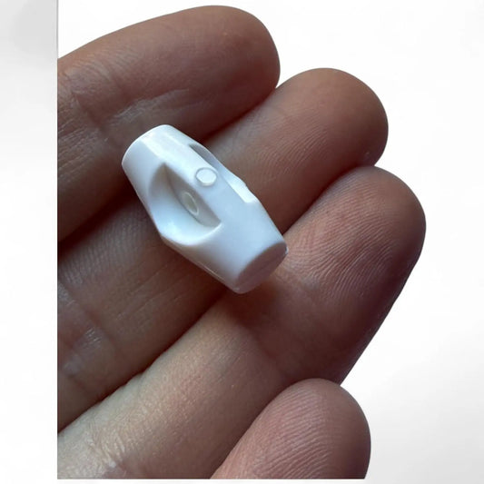
Baby Toggle Buttons, White Plastic Duffle Fasteners, 19mm, 6-Pack
Regular price £4.60 GBPRegular priceUnit price / per -
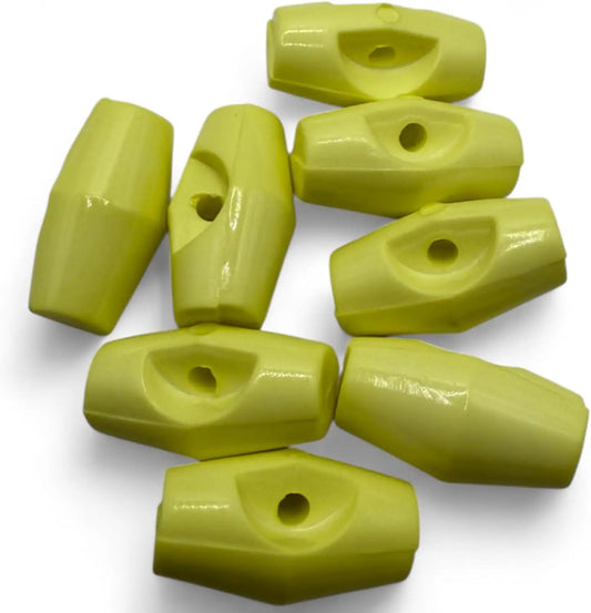
Baby Toggle Buttons, Plastic Duffle Fasteners, 19mm, Lemon, 6-Pack
Regular price £4.60 GBPRegular priceUnit price / per -
Baby Toggle Buttons, Blue Plastic Duffle Fasteners, 19mm, Pack of 6
Regular price £4.60 GBPRegular priceUnit price / per


